Monday, April 27, 2009

53.) Star plots


Star plots:


Also referred to as radar plots, this is a plot that can be more effective than a multiple bar chart for comparing small amounts of multivariate data.


52.) Correlation matrix


Correlation matrix:


A Correlation matrix describes correlation among M variables. It is a square symmetrical matrix with the element equal to the correlation coefficient between variables. The diagonal elements (correlations of variables with themselves) are always equal to 1.00. Shown above is a calculated protein correlation matrix for phage T7. Correlated behavior ranges from high(red) to low(blue), and the triangular block of red reflects proteins involved in phage assembly, a highly coordinated process.


51.) Similarity matrix

http://www.biomedcentral.com/content/figures/1471-2164-8-353-5-l.jpg
Similarity matrix:

A similarity matrix is a matrix of scores which express the similarity between two data points. Similarity matrices are strongly related to their counterparts, distance matrices and substitution matrices. This example shows the expression signature similarity matrix. In the upper-right triangle region, dark red colors indicate high similarity between signatures associated with two contrasts (indicated by row and column labels). The binary coding in the lower-left triangle region indicates whether signatures associated with two contrasts exhibit a significant level of similarity. The statistical procedure used to evaluate similarity is described in the Methods section.

50.) Stem and leaf plot


Stem and leaf plot
One way to make data more usable is to make a stem-and-leaf plot. The digit's in the greatest place value of the data values are the stems. The digits in the next greatest place values are the leaves. This example refers to the World Population Data Sheet in your Reference Section. Find the Per Capita GNP (US $) for each country. This refers to the annual income per person in U.S. dollars


49.) Box plot


Box plot:

In descriptive statistics, a box plot or boxplot is a convenient way of graphically depicting groups of numerical data through their five-number summaries. A boxplot may also indicate which observations, if any, might be considered outliers.


48.) Histogram


Histogram:


In statistics, a histogram is a graphical display of tabulated frequencies, shown as bars. It shows what proportion of cases fall into each of several categories, it is a form of data binning. The categories are usually specified as non-overlapping intervals of some variable. The categories must be adjacent. The intervals are generally of the same size, and are most easily interpreted if they are. Histograms are used to plot density of data, and often for density estimation,estimating the probability density function of the underlying variable.


47.) Parallel coordinate graph


Parallel coordinate graph:

Parallel coordinate graphs are used to show numerous amounts sets of data. This graph shows the ratios. Each line is a different variable and every line has a connection all the way through the graph.


46.) Triangular plot


Triangular plot:

A triangular plot is a map that graphically depicts the ratios of the three variables as positions in an equilateral triangle. It is used in petrology, mineralogy, metallurgy, and other physical sciences to show the compositions of systems composed of three species. In population genetics, it is often called a de Finetti diagram. In game theory, it is often called a simplex plot.


45.) Windrose


Windrose


A windrose is a Map diagram that summarizes information about the wind at a particular location over a specified time period. A wind rose was also, before the use of magnetic compasses, a guide on mariners’ charts to show the directions of the eight principal winds. The modern wind rose used by meteorologists gives the percentage of the time the wind blows from each direction during the observation period; it sometimes shows the strengths of these winds and the percentage of the time calm air or light winds are observed. This wind rose usually has eight radiating lines, whose lengths are proportional to wind frequency, and shows wind strength by the thickness of the lines or by feathers attached to them. The frequency of calm or nearly calm air is given as a number in the centre.


44.) Climograph


Climograph

A climograph is a graphical depiction of the monthly precipitation and temperature conditions for a selected place. Precipitation is shown by the bar graph. A line graph depicts temperature.


43.) Population profile

http://camellia.shc.edu/literacy/tablesversion/assignments/Image2.jpg
Population profile:


A population profile chart showing the number of people as a function of their ages. This map shows Populations, whether of humans or other organisms, change over time depending on births and deaths as well as migration into and out of an area. Most populations fluctuate mildly over time. Prior to the Industrial Revolution, the human population was stable with minor fluctuations. Populations grew very slowly and growth was apparent only after thousands of years. Since the Industrial Revolution human populations have increased dramatically, growing exponentially with each year and reaching 6 billion by October 1999.

42.) Scatterplot


Scatterplot:

A scatter plot only specifies variables or independent variables when a variable exists that is under the control of the experimenter. If a parameter exists that is systematically incremented and/or decremented by the experimenter, it is called the control parameter or independent variable and is customarily plotted along the horizontal axis. The measured or dependent variable is customarily plotted along the vertical axis. If no dependent variable exists, either type of variable can be plotted on either axis and a scatter plot will illustrate only the degree of correlation (not causation) between two variables. This map shows the relationship between grip strength and arm strength depicted in (also described in the introductory section) is 0.63.


41.) Index value plot


Index value plot:


An index value plot, plots distances against the corresponding observation number in the dataset. In many cases, the row number corresponds to the order in which the data were collected. If this is the case, this would be similar to plotting the residuals against time. The index plot is a helpful diagnostic test for normal linear and particularly generalized linear models. Both outliers and influential points can be detected by the index plot. It is particularly useful when the data is in time order so that pattern in the residuals, over time can be detected. If a residual index plot is showing a trend in time, then they are not independent.


40.) Accumulative line graph or Lorenz curve


Accumulative line graph or Lorenz curve:


This is an example of the Lorenz curve or an Accumulative line graph meaning the overall probability of two scenarios distributed on a graph. These distributions can be infinite but will always start at 0 but are invariant .

39.) Bilateral graph


Bilateral graph:


A Bilateral Graph is a line graph that shows two different variations. This is a map of Bilateral official humanitarian assistance expenditure in 2006.

38.) Nominal area choropleth map


Nominal area choropleth map:


Nominal area choropleth map is a choropleth map that is used to dispaly nominal data. Also known as a descriptive map this nominal area choropleth map provides geographical information about Africa. The variation in color is associated with qualitative differences.


http://mapmaker.rutgers.edu/355/africa_political.gif

37.) Unstandardized choropleth maps


Unstandardized choropleth maps:


Unstandardized choropleth maps are unordered maps; there is no specific ranking assigned to the class - one category is not higher or lower than the other. The maps utilize numbers when displayed.


36.) Standardized choropleth maps


Standardized choropleth maps:


Data in choropleth maps are standardized to allow comparison of distribution among different areas. Here is a map of Canada displaying the different area's population of people age 14 and under.


http://www.statcan.gc.ca/pub/92f0138m/2008003/figures/figure3.1-en.jpg

35.) Univariate choropleth maps


Univariate choropleth maps:


A univariate choropleth map displays a single data set. Here only one set of data is displayed regarding poverty in the United States.


34.) Bivariate choropleth maps


Bivariate choropleth maps:
A bivariate map displays two variables on a single map by combining two different sets of graphic symbols or colors. Bivariate mapping is an important technique in cartography. Given a set of geographic features, a bivariate map displays two variables on a single map by combining two different sets of graphic symbols. It is a variation of simple choropleth map that portrays two separate phenomena simultaneously. The main objective of a bivariate map is to find a simple method for accurately and graphically illustrating the relationship between two spatially distributed variables. A bivariate map has potential to reveal relationships between variables more effectively than a side-by-side comparison of the corresponding univariate maps


33.) Unclassed choropleth maps


Unclassed choropleth maps:


This technique assigns shadings proportional to the data values so that these choropleth maps do not have to classify the data. This method of mapping has not been generally accepted because many cartographers claim that they lose the ability to direct the message of communication.


32.) Classed choropleth maps


Classed choropleth maps:
A classed choropleth map the main objective is to determine height and shading or color intensity of the bar for each map classed. This would involve creating a classed frequency legend including a frequency histogram, a frequency curve, and shading.


31.) Range graded proportional circle map

http://4.bp.blogspot.com/_VCI4AaOLs-A/SG5UMGyLShI/AAAAAAAAAJg/gxr7MsBTolw/s400/range%2Bgraded.jpg
Range graded proportional circle map:


A range graded proportional circle map is a proportional circle map that depicts the circles in relation to ranges of data. The information is classified as equal quantiles, breaks, natural breaks, and minimum variance.


30.) Continuously variable proportional circle map


Continuously variable proportional circle map:
A continuously variable proportional circle map is a proportional circle map which utilizes circles to create point data. This relates the scales to the specific data. The circles are in proportion to the variable being measured.


29.) DOQQ


DOQQ:


An orthophoto or orthophotograph is an aerial photograph geometrically corrected, such that the scale is uniform: the photo has the same lack of distortion as a map. Unlike an uncorrected aerial photograph, an orthophotograph can be used to measure true distances, because it is an accurate representation of the earth's surface, having been adjusted for topographic relief, lens distortion, and camera tilt. Orthophotographs are commonly used in the creation of a Geographic Information System, software can display the orthophoto and allow an operator to digitize or place linework, text annotations or geographic symbols.


28.) DEM


DEM:
A digital elevation model is a digital representation of ground surface topography or terrain. It is also widely known as a digital terrain model (DTM). A DEM can be represented as a raster or as a triangular irregular network,DEMs are commonly built using remote sensing techniques, however, they may also be built from land surveying. DEMs are used often in geographic information systems, and are the most common basis for digitally-produced relief maps.


27.) DLG


DLG:

http://weather.unisys.com/usgs/3sec/usgs-US.gif

Digital Line Graphs (DLGs) are digital vector representations of cartographic information derived from USGS maps and related sources.

Sunday, April 19, 2009

26.) DRG


DRG:

http://www.nysgis.state.ny.us/gisdata/quads/images/sampldrg.gif

A digital raster graphic (DRG) is a scanned image of a U.S. Geological Survey (USGS) standard series topographic map, including all map collar information. The image inside the map neatline is georeferenced to the surface of the earth and fit to the Universal Transverse Mercator projection. The horizontal positional accuracy and datum of the DRG matches the accuracy and datum of the source map. The map is scanned at a minimum resolution of 250 dots per inch.


25.) Isopleths


Isopleths:
An isopleth map generalizes and simplifies data with a continuous distribution. It shows the data as a third dimension on a map, thus isopleth maps are more common for mapping surface elevations, amounts of precipitation, atmospheric pressure, and numerous other measurements that can be viewed statistically as a third dimension. The third dimension is shown by a series of lines called isopleths which connect points of equal value. The isopleth interval is the difference in value between two adjacent isopleths. The values of the isopleths drawn on the map are ALWAYS multiples of the interval. Isopleths never cross or divide and always form enclosed circles, however, this occurrence may not be in the mapped area.


http://www.meteoswiss.admin.ch/web/en/climate/climate_international/gaw-ch/ozone/umkehr.Par.0004.Image.gif

24.) Isopach


Isopach:


A contour that connects points of equal thickness. Commonly, the isopachs, or contours that make up an isopach map, display the stratigraphic thickness of a rock unit as opposed to the true vertical thickness. Isopachs are true stratigraphic thicknesses; i.e., perpendicular to bedding surfaces. Map of the areal extent and variation of a stratigraphic unit and used in geological exploration for oil and for underground structural analysis.


23.) Isohyets


Isohyets:
A line drawn on a map connecting points that receive equal amounts of rainfall at a certain time or for a stated period. An isohyet is a line joining points of equal precipitation on a map. A map with isohyets is called an isohyetal map.


22.) Isotachs


Isotachs:
These are lines of equal wind speed. They are most often contoured in the upper levels of the atmosphere, especially at the jet stream level. They are important for locating the jet stream and jet streaks within a jet stream.


21.) Isobars

Isobars:

http://z.about.com/d/german/1/0/1/J/aWetteurfronts.jpg
An isobar is a line of equal or constant barometric pressure on a graph, plot, or map. In meteorology, the barometric pressures shown are reduced to sea level, not the surface pressures at the map locations. The distribution of isobars is closely related to the magnitude and direction of the wind field, and can be used to predict future weather patterns.

20.) LIDAR


LIDAR:

Lidar uses laser light to measure distances. It is used in many ways, from estimating atmospheric aerosols by shooting a laser skyward to catching speeders in freeway traffic with a handheld laser-speed detector. Airborne laser-scanning technology is a specialized, aircraft-based type of lidar that provides extremely accurate, detailed 3-D measurements of the ground, vegetation, and buildings. Developed in just the last 15 years, one of lidar’s first commercial uses in the United States was to survey powerline corridors to identify encroaching vegetation. Additional uses include mapping landforms and coastal areas. In open, flat areas, ground contours can be recorded from an aircraft flying overhead providing accuracy within 6 inches of actual elevation. In steep, forested areas accuracy is typically in the range of 1 to 2 feet and depends on many factors, including density of canopy cover and the spacing of laser shots. The speed and accuracy of lidar made it feasible to map large areas with the kind of detail that before had only been possible with time-consuming and expensive ground survey crews.


http://www.icrest.missouri.edu/Sensors/lidar.jpg

19.) Doppler radar

Doppler radar:

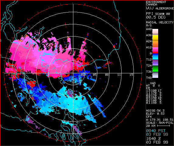
An actual doppler radar is seen here for
farmers and land managers to benefit from. Now improved weather and climate predictions generated by a new state-of-the-art radar in Bairnsdale. The new radar is more precise, more sensitive to changes in the weather and has better resolution than the obsolete East Sale radar. For the first time, the local radar will be used solely for radar watch, meaning the images will be available 24 hours a day, without interruption.


http://www.bom.gov.au/weather/radar/about/images/melb_doppler_radar.jpg


Now, this is a doppler radar image. Which is a Doppler radar that hinges on the fact that frequency emissions varies if either the object transmitting the signal or the object receiving the signal moves relative to the other. Incidentally the word Doppler comes from the name Johann Christian Doppler, who was the Austrian mathematician who developed the theory that an observer's perception of frequency emissions varied with the relative motion between the source of the transmission and the receiver. He demonstrated this "Doppler effect". Doppler radar equipment is capable of detecting target motion due to this Doppler effect, which helps with the identification of supercell thunderstorms.


http://www.stuffintheair.com/images/DopplerRadar.gif


18.) Black and white aerial photo

http://freegeographytools.com/wp-content/uploads/2007/09/doq-thumb.jpg
Black and white aerial photo:
Black and white Aerial photography is the taking of photographs of the ground from an elevated position. The term usually refers to images in which the camera is not supported by a ground-based structure. Aerial photographs have been a main source of information about what is at the Earth's surface almost since the beginning of aviation more than 100 years ago.


17.) Infrared aerial photo


Infrared aerial photo:


Infrared aerial photography is a powerful tool. Not only can it be used to document changes to the environment, the health of forests, wetlands, bays and oceans, but it can also be used to document and monitor such items as damage to roofs, the tracking of dairy farm out flows, pinpointing the source of, and monitoring, insect or disease infested vineyards, or sites contaminated by toxic chemicals, and many more applications.
Infrared film and infrared digital sensors are sensitive to a certain portion of the spectrum of light, and by careful filtration, processing and selection of films, infrared aerials can provide invaluable information.

16.) Cartographic Animation

http://uwacadweb.uwyo.edu/JSHINKER/animations/global/gifs/vmag500winds_web.gif
Cartographic Animation:
The cartographic animation is an example of the seasonal cycle for inflow, outflow and storage of moisture as part of the global water balance. Cartographic animation is graphic art that occurs in time, animation is a dynamic visual statement that evolves through various interval changes in the display.


Saturday, April 18, 2009

15.) Statistical Map

Statistical Map:


http://personalpages.manchester.ac.uk/staff/m.dodge/cybergeography/atlas/mids_af_i_gr_c_large.gif

A Statistical map gives a standard statistic of the functional time course over a specified set of periods. It is also a graphic representation of elements of importance or interest pertaining to a theme, such as the geographic occurrence of an item, feature, or event.

14.) Cartograms

Cartograms:


A cartogram is a map in which some thematic mapping variable, (such as travel time or Gross National Product), is substituted for land area. The geometry or space of the map is distorted in order to convey the information of this alternate variable. There are two main types of cartograms: area and distance cartograms.


An area cartogram is sometimes referred to as a value-by-area map or an isodemographic map, the latter particularly for a population cartogram, which illustrates the relative sizes of the populations of the countries of the world by scaling the area of each country in proportion to its population; the shape and relative location of each country is retained to as large an extent as possible, but inevitably a large amount of distortion results


A distance cartogram may also be called a central-point cartogram. This form is typically used to show relative travel times and directions from vertices in a network.

http://mapmaker.rutgers.edu/355/cartogram_ValueByArea2.jpg

13.) Flow maps

Flow Map:


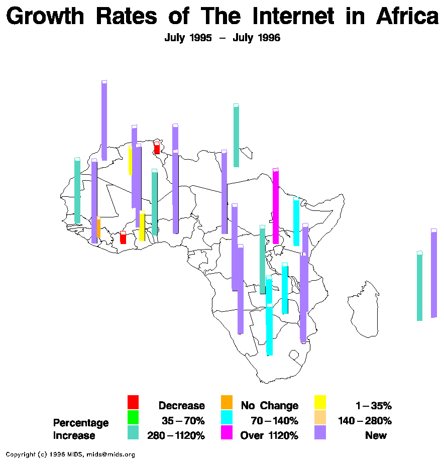
http://www.mpassociates.gr/software/distrib/science/golden/PrismMap.gif

Cartographers have long used flow maps to show the movement of objects from one location to another, such as the number of people in a migration, the amount of goods being traded, or the number of packets in a network. The advantage of flow maps is that they reduce visual clutter by merging edges. Most flow maps are drawn by hand and there are few computer algorithms available. Some generate flow maps using hierarchical clustering given a set of nodes, positions, and flow data between the nodes. These techniques are inspired by graph layout algorithms that minimize edge crossings and distort node positions while maintaining relative position to one another. It demonstrates technique by producing flow maps for network traffic, census data, and trade data. ect.

12.) Isoline Map


Isoline Map:


This map of rainfall isolines atop a Landsat image of Maui, Hawaii, illustrates why educators teach with GIS: Students can readily uncover relationships and patterns from processes operating on our world—from local to global scales. An isoline map is a map with continuous lines joining points of the same value. Examples would be equal altitude (contour lines), temperature (isotherms), barometric pressure (isobars), wind speed (isotachs), wind direction (isogon), wind shear (isoshear), etc. Isoline mapping is used to interpret the information on some thematic maps.

11.) Proportional circle maps


Proportional circle map:


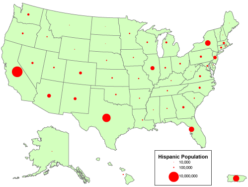
The AREA of each circle is proportional to a value in a data set. Other shapes (square, triangle, picture of something) can be used. They can be subdivided.

https://courseware.e-education.psu.edu/courses/geog482/graphics/hisp_circles.gif

10.) Choropleth maps


Choropleth Map:


A choropleth map is a thematic map in which areas are shaded or patterned in proportion to the measurement of the statistical variable being displayed on the map, such as population density or per-capita income. The choropleth map provides an easy way to visualize how a measurement varies across a geographic area or it shows the level of variable within a region.

9.) Dot distribution Map

Dot distribution Map:


http://www.siskiyous.edu/class/geog1b/PracticeQuizzes/AIDS1997US.gif

Distribution can be shown as a dot distribution map. A Dot Map uses a form of a point symbol, its purpose is to show a continuous density through a discrete set of point symbols. Ideally, you would have a lot of detail information and select a location that characterizes the distribution (ex. keeping the dots along rivers or roads) This means that the dot map would require some hidden map layers.

8.) Propaganda maps


Propaganda Maps:
Many propaganda maps were produced during wartime. These maps have a type of political persuasion that often utilizes cartographic representation as such. They contain clear-cut subjective and ideological distortions; in other words, they contain hidden
propaganda.


7.) Hypsometric Maps

Hypsometric Map:


http://www.reliefshading.com/colors/pictures/hypsometric_AegeanSea.jpg

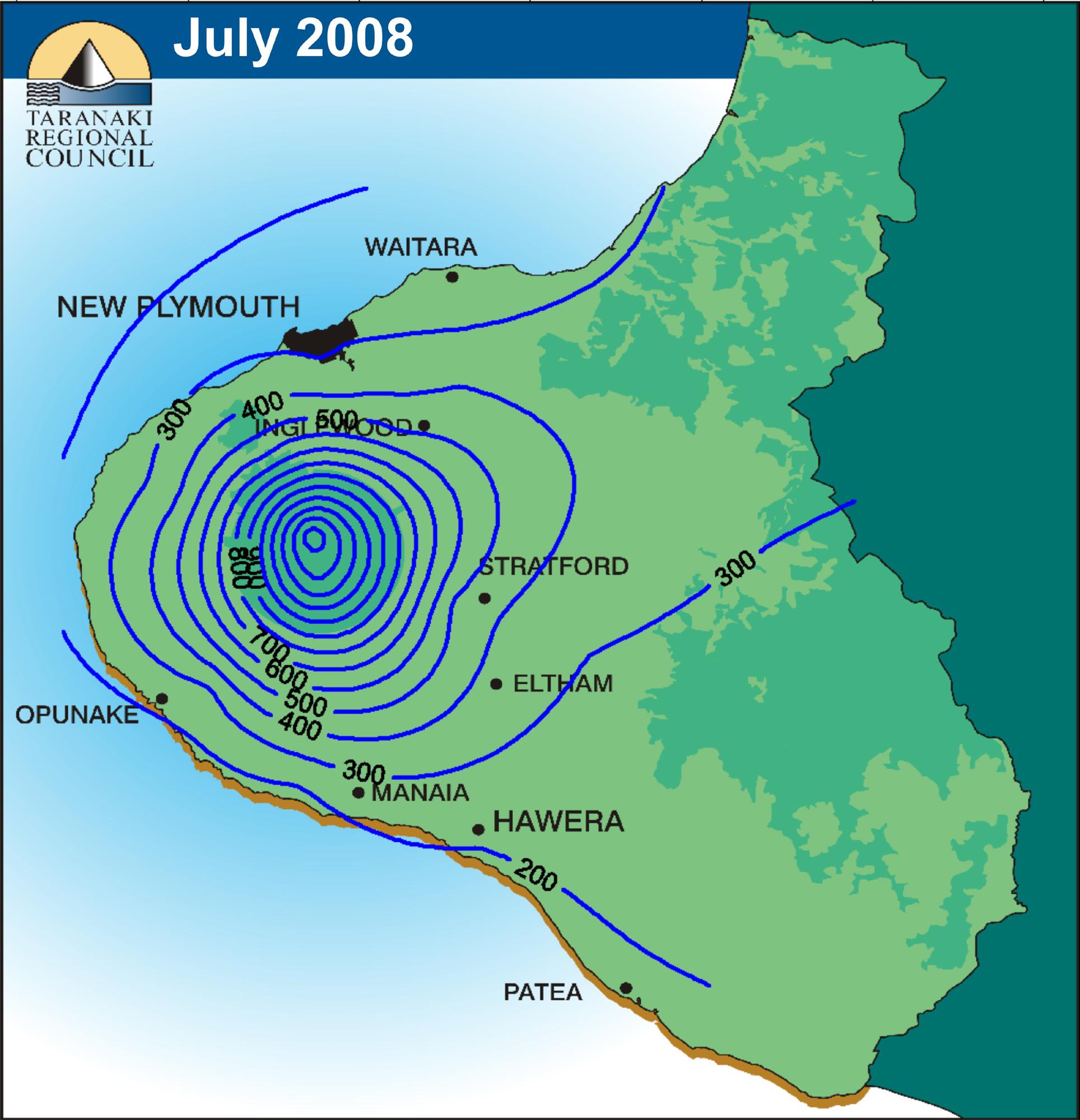
Any map showing relief by means of contours, hachures, shading, tinting,or any other convention.