Monday, April 27, 2009

53.) Star plots


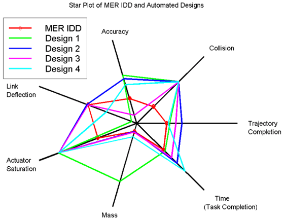
Star plots:


Also referred to as radar plots, this is a plot that can be more effective than a multiple bar chart for comparing small amounts of multivariate data.


52.) Correlation matrix


Correlation matrix:


A Correlation matrix describes correlation among M variables. It is a square symmetrical matrix with the element equal to the correlation coefficient between variables. The diagonal elements (correlations of variables with themselves) are always equal to 1.00. Shown above is a calculated protein correlation matrix for phage T7. Correlated behavior ranges from high(red) to low(blue), and the triangular block of red reflects proteins involved in phage assembly, a highly coordinated process.


51.) Similarity matrix

http://www.biomedcentral.com/content/figures/1471-2164-8-353-5-l.jpg
Similarity matrix:

A similarity matrix is a matrix of scores which express the similarity between two data points. Similarity matrices are strongly related to their counterparts, distance matrices and substitution matrices. This example shows the expression signature similarity matrix. In the upper-right triangle region, dark red colors indicate high similarity between signatures associated with two contrasts (indicated by row and column labels). The binary coding in the lower-left triangle region indicates whether signatures associated with two contrasts exhibit a significant level of similarity. The statistical procedure used to evaluate similarity is described in the Methods section.

50.) Stem and leaf plot


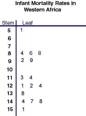
Stem and leaf plot
One way to make data more usable is to make a stem-and-leaf plot. The digit's in the greatest place value of the data values are the stems. The digits in the next greatest place values are the leaves. This example refers to the World Population Data Sheet in your Reference Section. Find the Per Capita GNP (US $) for each country. This refers to the annual income per person in U.S. dollars


49.) Box plot


Box plot:

In descriptive statistics, a box plot or boxplot is a convenient way of graphically depicting groups of numerical data through their five-number summaries. A boxplot may also indicate which observations, if any, might be considered outliers.


48.) Histogram


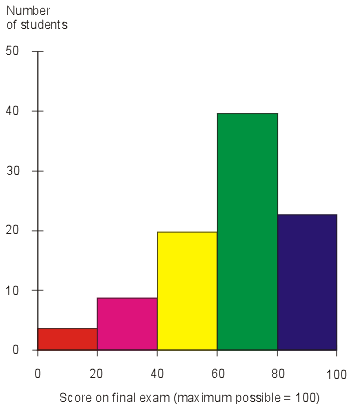
Histogram:


In statistics, a histogram is a graphical display of tabulated frequencies, shown as bars. It shows what proportion of cases fall into each of several categories, it is a form of data binning. The categories are usually specified as non-overlapping intervals of some variable. The categories must be adjacent. The intervals are generally of the same size, and are most easily interpreted if they are. Histograms are used to plot density of data, and often for density estimation,estimating the probability density function of the underlying variable.


47.) Parallel coordinate graph


Parallel coordinate graph:

Parallel coordinate graphs are used to show numerous amounts sets of data. This graph shows the ratios. Each line is a different variable and every line has a connection all the way through the graph.