Monday, April 27, 2009

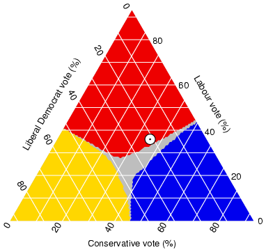
46.) Triangular plot


Triangular plot:

A triangular plot is a map that graphically depicts the ratios of the three variables as positions in an equilateral triangle. It is used in petrology, mineralogy, metallurgy, and other physical sciences to show the compositions of systems composed of three species. In population genetics, it is often called a de Finetti diagram. In game theory, it is often called a simplex plot.


45.) Windrose


Windrose


A windrose is a Map diagram that summarizes information about the wind at a particular location over a specified time period. A wind rose was also, before the use of magnetic compasses, a guide on mariners’ charts to show the directions of the eight principal winds. The modern wind rose used by meteorologists gives the percentage of the time the wind blows from each direction during the observation period; it sometimes shows the strengths of these winds and the percentage of the time calm air or light winds are observed. This wind rose usually has eight radiating lines, whose lengths are proportional to wind frequency, and shows wind strength by the thickness of the lines or by feathers attached to them. The frequency of calm or nearly calm air is given as a number in the centre.


44.) Climograph


Climograph

A climograph is a graphical depiction of the monthly precipitation and temperature conditions for a selected place. Precipitation is shown by the bar graph. A line graph depicts temperature.


43.) Population profile

http://camellia.shc.edu/literacy/tablesversion/assignments/Image2.jpg
Population profile:


A population profile chart showing the number of people as a function of their ages. This map shows Populations, whether of humans or other organisms, change over time depending on births and deaths as well as migration into and out of an area. Most populations fluctuate mildly over time. Prior to the Industrial Revolution, the human population was stable with minor fluctuations. Populations grew very slowly and growth was apparent only after thousands of years. Since the Industrial Revolution human populations have increased dramatically, growing exponentially with each year and reaching 6 billion by October 1999.

42.) Scatterplot


Scatterplot:

A scatter plot only specifies variables or independent variables when a variable exists that is under the control of the experimenter. If a parameter exists that is systematically incremented and/or decremented by the experimenter, it is called the control parameter or independent variable and is customarily plotted along the horizontal axis. The measured or dependent variable is customarily plotted along the vertical axis. If no dependent variable exists, either type of variable can be plotted on either axis and a scatter plot will illustrate only the degree of correlation (not causation) between two variables. This map shows the relationship between grip strength and arm strength depicted in (also described in the introductory section) is 0.63.


41.) Index value plot


Index value plot:


An index value plot, plots distances against the corresponding observation number in the dataset. In many cases, the row number corresponds to the order in which the data were collected. If this is the case, this would be similar to plotting the residuals against time. The index plot is a helpful diagnostic test for normal linear and particularly generalized linear models. Both outliers and influential points can be detected by the index plot. It is particularly useful when the data is in time order so that pattern in the residuals, over time can be detected. If a residual index plot is showing a trend in time, then they are not independent.


40.) Accumulative line graph or Lorenz curve


Accumulative line graph or Lorenz curve:


This is an example of the Lorenz curve or an Accumulative line graph meaning the overall probability of two scenarios distributed on a graph. These distributions can be infinite but will always start at 0 but are invariant .